Houston ISD Stem Summer Camp Website Redesign

Programs Used
- Adobe Illustrator
- Blackboard LMS
- Adobe Photoshop
About Project
The Houston Independent School District is the largest school district in the state of Texas. With 194,000 students and 27,000 staff members, HISD has the adequate tools and support to ensure the success of all districts stakeholders. The availability of new age skills and technologies is ever-growing, and the Science, Technology, Engineering, and Math (STEM) program reiterates these skills. Yearly, the district holds it’s STEM camp which allows teachers to be trained and teach students all aspects of STEM education. The program website serves as the initial checkpoint when inquiring information about the camp.

Task
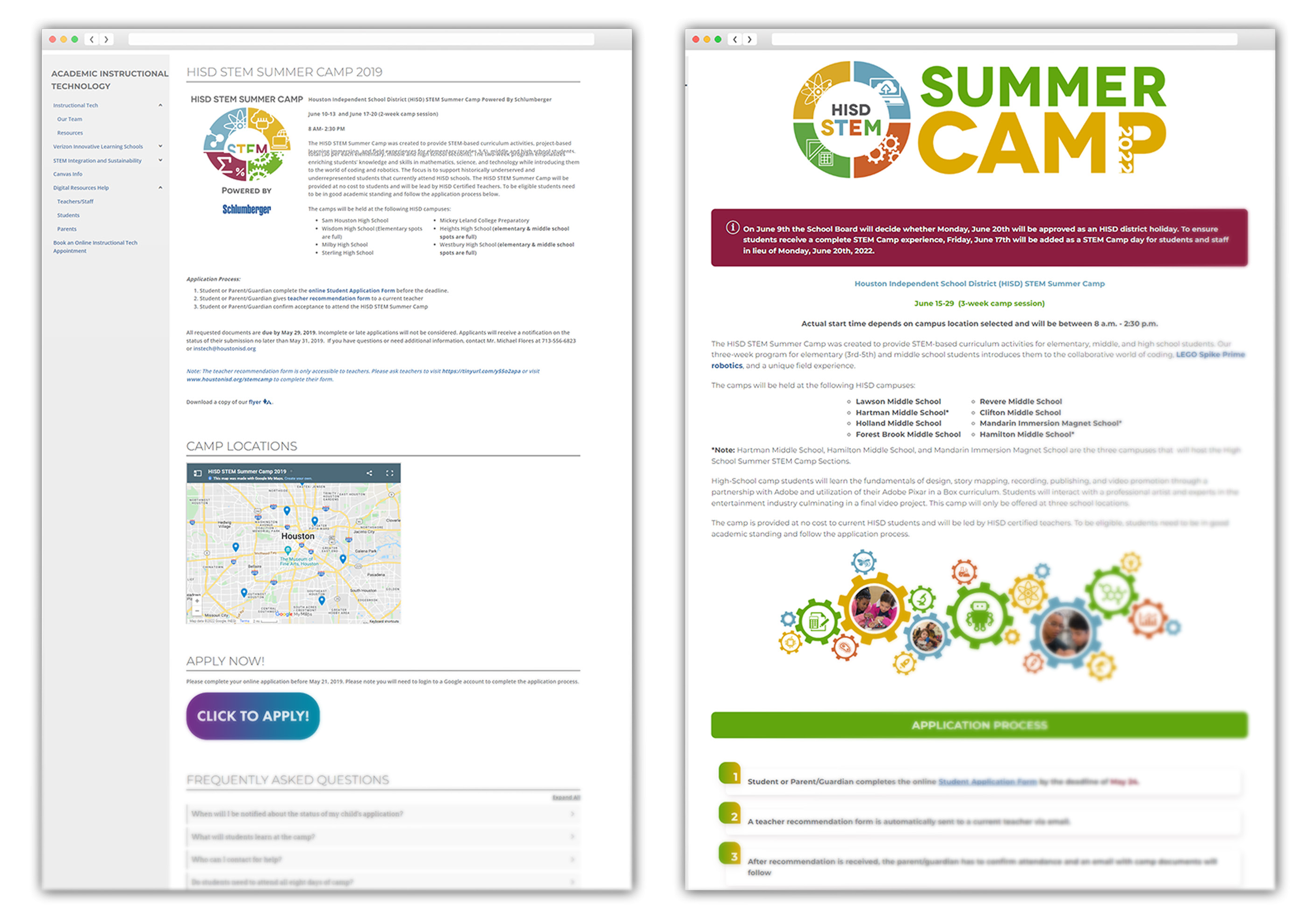
I was tasked with the project of redesigning/redeveloping the STEM Camp webpage to make it more intuitive, brand aligning, and functional. I was also tasked with updating the camp logo and creating a more engaging flyer.
Problem

The previous years’ webpage appeared to be not completely aligned with the districts’ branding, as well as lacking in functionality. The team inquired about a layout that could be easy on the eyes as well as easy to navigate through.
Audience
The main audience for this project were teachers, parents, and students.
- Parents needed to know the basic information about camp dates, locations and offerings
- Teachers needed to know how to communicate the camp information to their students as well as apply to teach if interested
- Students needed to know the camp overview and offerings
Design Process/Research
I first browsed through the previous years’ webpage. It had the look and feel as a newsletter and ideas were to make it more engaging. The idea was that a student can visit the webpage, see the flyer, and say, “I want to attend STEM Camp!” The information about the camp should also be short, sweet, and straight to the point. I used Adobe Illustrator, html, and CSS to complete this project. Blackboard/Schoolwires is the hosting site used. Fonts were changed to Montserrat to adhere to district branding as well as the colors.
Outcomes and Results
The title from the previous years’ camp was a header and blended in with other text. To make the name of this page stand out, I created a text based graphic with the newly designed logo and camp year embedded in the letter “P.”


The previous “Click to Apply” button didn’t align with the districts’ branding guide, and took up a large amount of space. As a minor adjustment, I was able to make the gradient colors on-brand and reduce the size, adding a thin outline for additional definition. I also made the borders less round. Code from CodePen

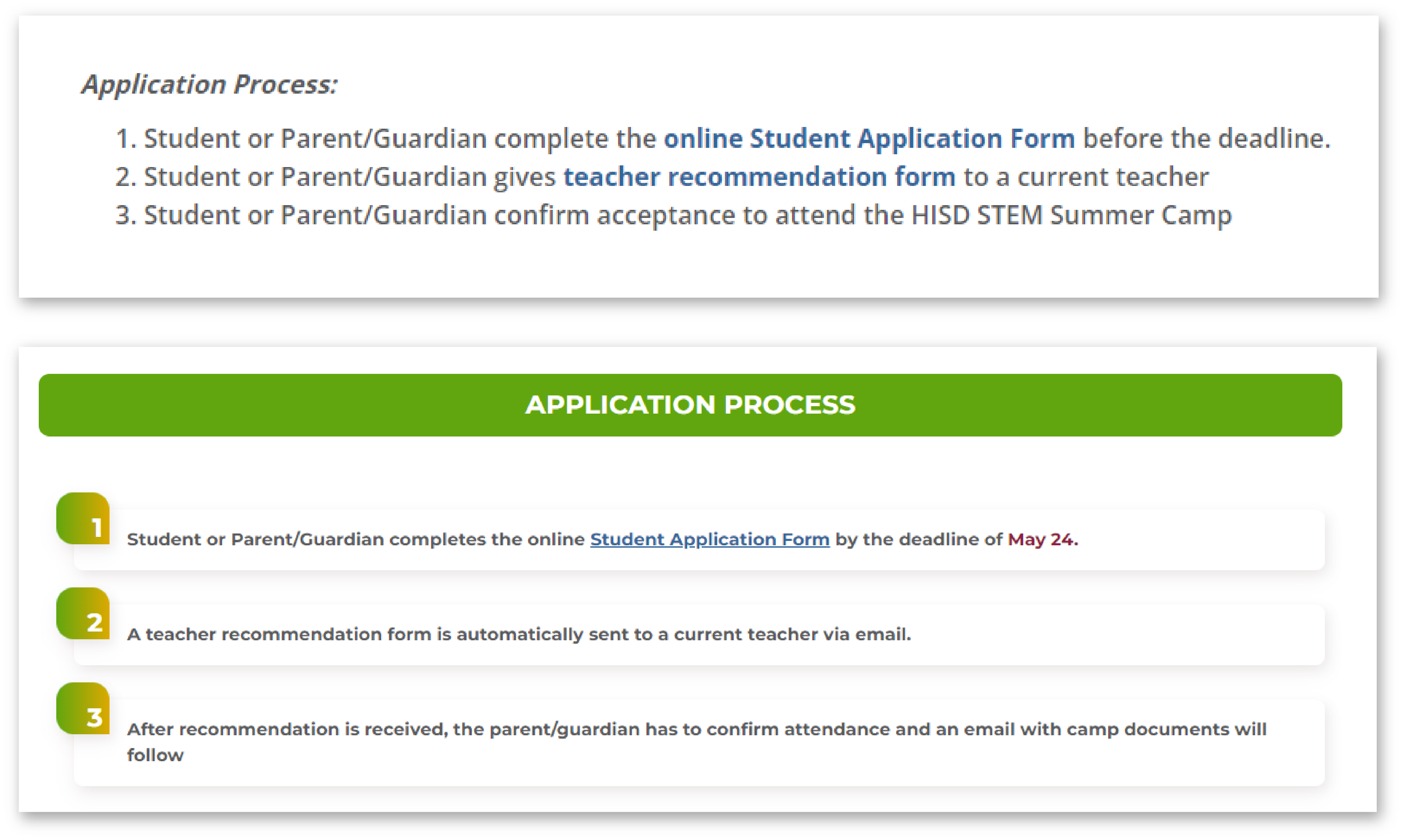
On the previous years’ webpage, the application process was listed right under the location sites’ names. I felt it would be more intuitive to break up these sections with a graphic and list the steps in a visually appealing way.

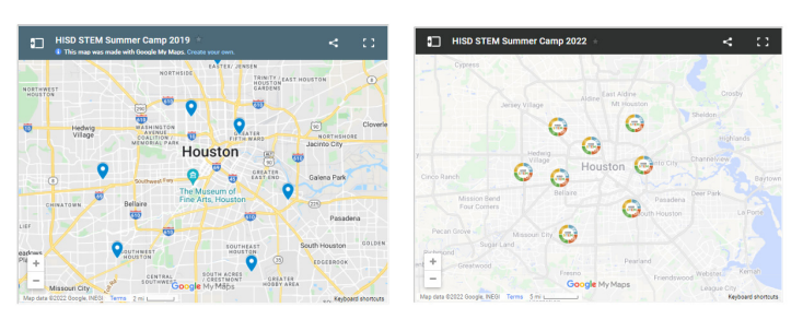
A highlight of this webpage rebuild was the Google Maps embed. Previously, the camp location icons were traditional “location” icons that blended in with the map. I replaced those icons with the STEM Camp logo, changed the map view to remove the listing of so many locations, and gave the map the “light political” contrast. This made it easier to identify the camps sites.
Reflection, lessons, next steps

This project had a strict deadline. Given additional time, I would have incorporated more visually appealing and interactive elements showcasing the camp offerings. I will carefully consider any feedback received from users to ensure all aspects are perfected.
